
Why Responsive Web Design Is Crucial for Your Website's Success
Introduction
- Imagine visiting a website on your phone, only to find tiny text, misplaced buttons, and images that won’t fit the screen. Frustrating, right? In today’s world, people browse the internet on all kinds of devices—smartphones, tablets, laptops, and desktops—each with different screen sizes.
- If your website doesn’t adapt seamlessly to these devices, you risk losing visitors, customers, and even business opportunities.
- This is where responsive web design comes in. It ensures your website looks great and works perfectly, no matter what device your audience uses. Let’s explore why responsive design is a must for your website’s success.
What Is Responsive Web Design?
- Responsive web design is an approach that allows your website to automatically adjust its layout, images, and content based on the screen size of the device.
- Whether someone views it on a 27-inch desktop monitor or a 5-inch smartphone, a responsive website delivers an optimal experience—no zooming, scrolling, or resizing required.
Visual Example: The "Magic Liquid" Website
- Imagine your website is like liquid in a container:
- Pour it into a wide bowl (desktop monitor) → It spreads out naturally.
- Pour it into a tall glass (tablet) → It reshapes to fit the height.
- Pour it into a small shot glass (smartphone) → It condenses but stays perfectly usable.
Just like liquid, a responsive website:
✔ Fills any screen without spilling over (no horizontal scrolling).
✔ Keeps its "shape" (text, buttons, menus) easy to interact with.
✔ Never forces users to pinch-zoom or squint.
- Think of it like water: it flows and fits into any container. Similarly, a responsive website smoothly reshapes itself to provide the best possible viewing experience.
Why Is Responsive Design Essential?
1. Mobile Users Dominate the Web
Recent data shows that 58.33% of all global website traffic now comes from mobile devices (StatCounter, July 2024). If your site isn't mobile-friendly, you risk losing 50% of potential customers who will abandon your site immediately (Google Mobile Usability Report, 2023). A responsive design solves this - companies that implement it see 64% higher conversion rates on mobile (Shopify Commerce Report, 2023) and 30% longer engagement times (Adobe Analytics).
Verified Sources:
https://www.shopify.com/blog/product-research
2. Better User Experience
A responsive website eliminates annoying pinching, zooming, or horizontal scrolling. Visitors enjoy smooth navigation, readable text, and well-placed buttons, making them more likely to return.
3. Higher Search Engine Rankings
Google prioritizes mobile-friendly websites in search results. If your site isn’t responsive, it could rank lower, making it harder for potential customers to find you.
4. Cost-Effective & Easy to Maintain
Instead of managing separate desktop and mobile versions, a responsive website means one design that works everywhere. This saves time, reduces maintenance costs, and ensures consistency across all devices.
How Does Responsive Design Work?
- Responsive websites use flexible grids, scalable images, and smart coding (like CSS media queries) to detect screen size and adjust the layout accordingly. Key elements include:
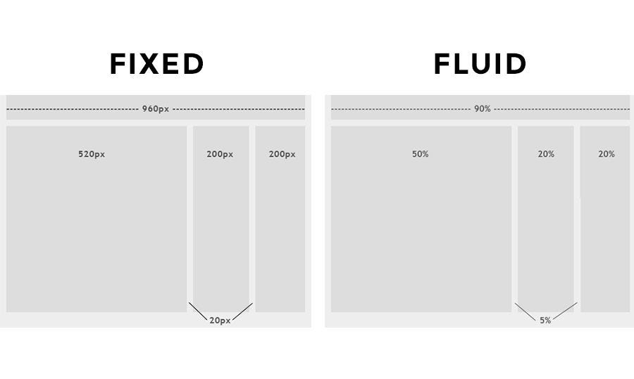
- Fluid Layouts – Content expands or shrinks based on screen width.
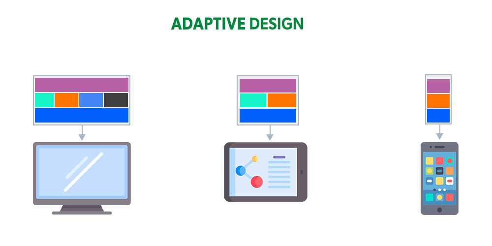
- Adaptive Images – Pictures resize automatically to avoid distortion.
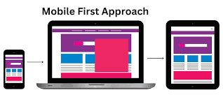
- Mobile-First Approach – Designing for small screens first ensures better performance on all devices.
Best Practices for a Responsive Website
- Keep it simple – Avoid clutter; prioritize key content.
- Optimize navigation – Use hamburger menus for mobile.
- Fast loading speed – Compress images and minimize heavy scripts.
- Test on multiple devices – Ensure compatibility across smartphones, tablets, and desktops.
FUEiNT Technologies: Your Partner for Responsive Web Design
- At FUEiNT technologies, we specialize in creating fast, beautiful, and fully responsive websites that attract and retain customers. Whether you’re launching a new site or upgrading an old one, our expert team ensures your website delivers a flawless experience on every device.
- Don’t let a poor mobile experience drive customers away. Contact us today to make your website responsive, user-friendly, and ready for success!